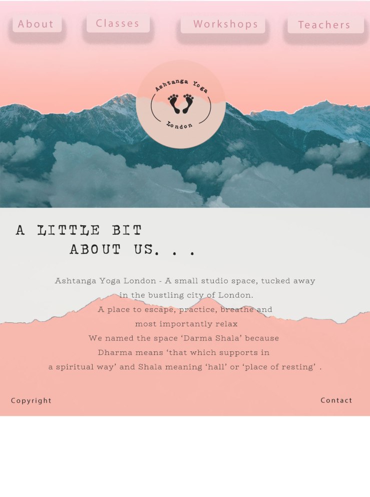
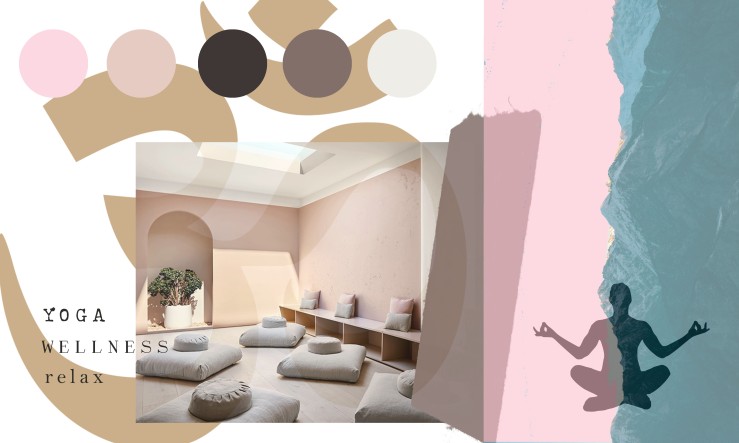
Here are my final two redesigns of my chosen bad website, Ashtanga Yoga London.
I tried to make the website more eye catching but with a calm vibe, using bright but soft colour palettes and cloud brushes to create a zen like feel.
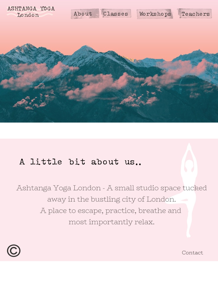
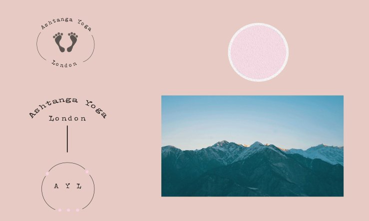
Here are my final two redesigns of my chosen bad website, Ashtanga Yoga London.
I tried to make the website more eye catching but with a calm vibe, using bright but soft colour palettes and cloud brushes to create a zen like feel.
In class we looked at interface design and did a workshop for this, which was too design
a grungy style wesbite for ‘Skateboard Sussex’.

Evaluation of my chosen website
The website I’ve chosen for my re-design is a yoga studio based in London, it lacks a lot of visual communication, the imagery used is very small, cropped and doesn’t give any insightful information.
They have used only one font throughout the website that is very basic and ends up blending in with CTA buttons and even the main heading and logo of the website. It’s also an extremely small font in a light grey colour that does not make it easy to read.
It’s not automatically obvious which information is necessary to read as it all looks very similar, so more time is spent scanning the page for the exact information you are looking for.
The navigation is clear and in the same spot on all pages but does not look like buttons that can be clicked on.
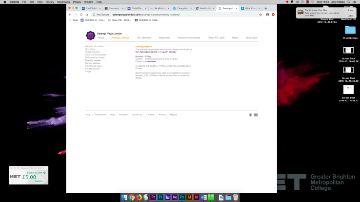
Specific content cannot be found easily, more than 3 clicks is needed to find certain bits of information that most people would look for on the website, e.g class timetable. There is no overall clear display of yoga class times or dates, you have to search through different links to find which classes you want and at which time of the day.
The load time of the website is rather quick due to the overall basicness of the website and content but this unfortunately does not leave you intrigued about what they are offering.
As the Yoga and wellness industry is quite competitive now it is important to stand out from the crowd and attract your customers with aesthetically pleasing imagery and colours, to try and put across the vibe or certain feel that you wish to create in your studio away from the internet.
I intend to keep the website simple so that the audience can find information quickly and easily, in doing so I will use colours and imagery that give off a calm and relaxing feel to entice the person using the website, to join the studio.
I will cut down the amount of links in the navigation bar and display necessary and clear information on each page.
For example; this website, another yoga studio in London has a modern and minimal but useful navigation bar at the top of the homepage, along with large images.
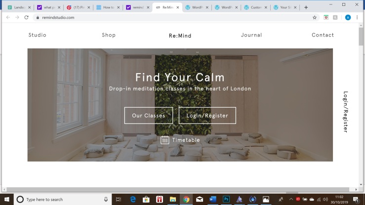
Although there are limited colours used in this website the imagery portrays exactly what they are offering and how their studio is presented. Which ultimately leaves the intended audience with a quick decision on if this certain studio is for them.
All the necessary information that you may be looking for quickly is located on the homepage and only 1 click away.
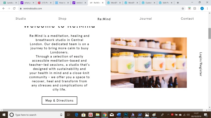
More detailed information can be found in the navigation bar and is located clearly in different sections, e.g studio, shop or contact.
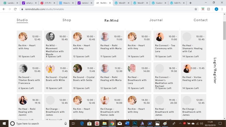
Unlike the previous website above, this page shows a clear and accurate timetable of classes which would be the most important information for users to look for. It’s big, obvious and has all the information you would be looking for, along with an online booking system that is user friendly.
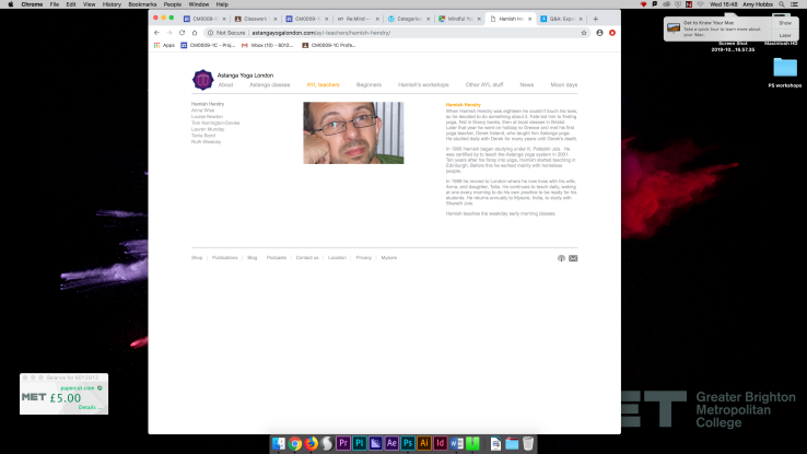
Screenshots from developing the Logo –
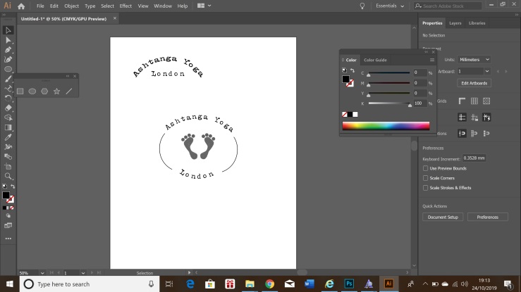
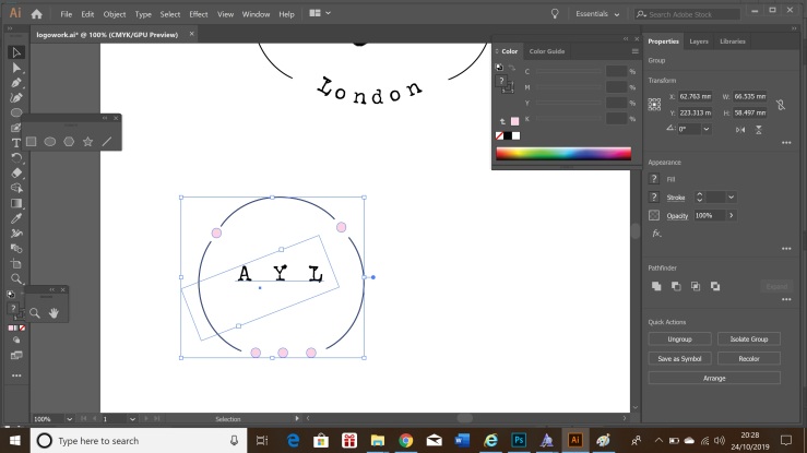
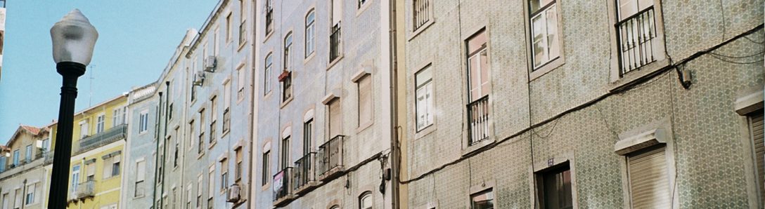
Image of the Himalaya’s I chose to use for the website redesign –